Tattoo Style
Lettering Tattoos
A practical guide to Lettering tattoos: where the style comes from, what makes it recognisable, prompt ideas, real community examples, and answers to the questions people ask before they commit.
Lettering tattoos at a glance
- Colour
- Black & grey
- Line weight
- Varied
- Skill level
- Intermediate
- Best placement
- Small, detailed spots
The history of Lettering tattoos
Lettering tattoos make words the entire design. The craft is typography on skin: script, blackletter, gothic, serif and freehand styles where the shape, rhythm and spacing of the letters carry as much meaning as the words themselves. A name, a date, a phrase or a single word becomes a piece of designed art, not just text. Readability and longevity are the core disciplines. Lettering has accompanied tattooing for as long as banners and memorial names have existed, and it deepened into a specialist craft as script artists treated it with the seriousness of hand-lettering and calligraphy. Its honest constraint is unforgiving: a crooked baseline, inconsistent weight or letters placed too thin or too small are immediately visible and tend to close up as skin ages. Strong lettering is therefore as much about layout and spacing as it is about flourish.
Where Lettering comes from
Tattoo lettering grows out of sign-painting, calligraphy and the banner tradition of early Western tattooing, refined by dedicated script specialists. The American script lineage associated with artists like BJ Betts treats letterforms as a discipline in its own right. It is a craft tradition focused on legibility and structure, which is why experienced lettering artists plan spacing and baseline as carefully as the style of the letters.
AI prompt ideas for Lettering tattoos
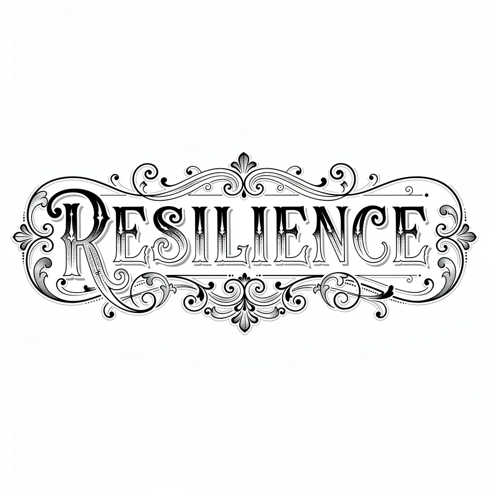
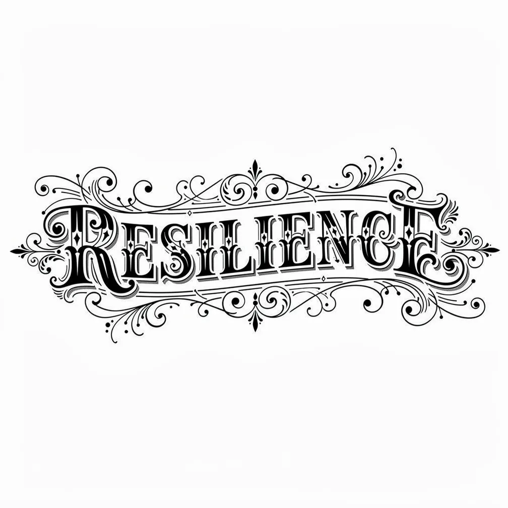
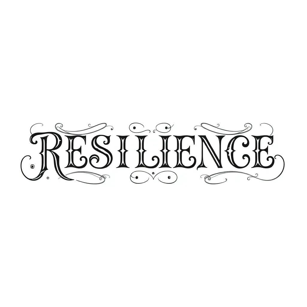
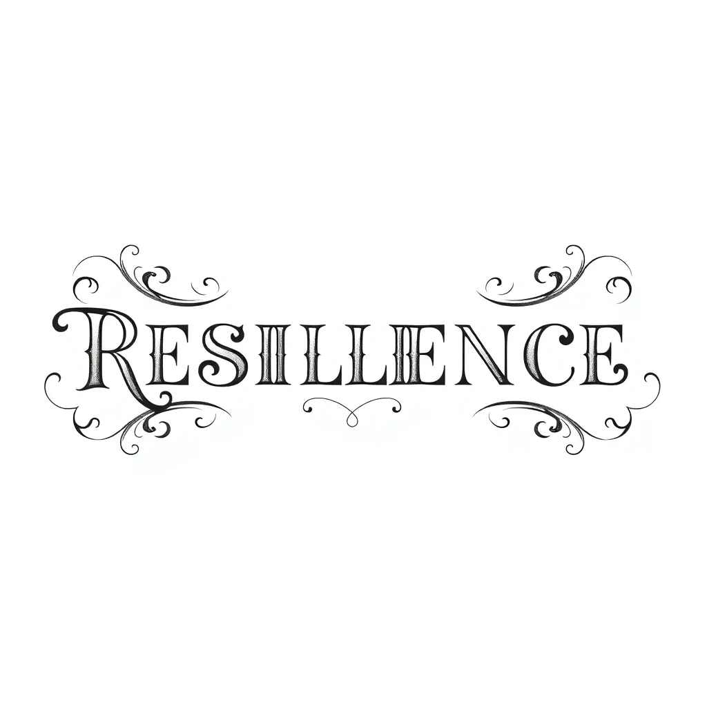
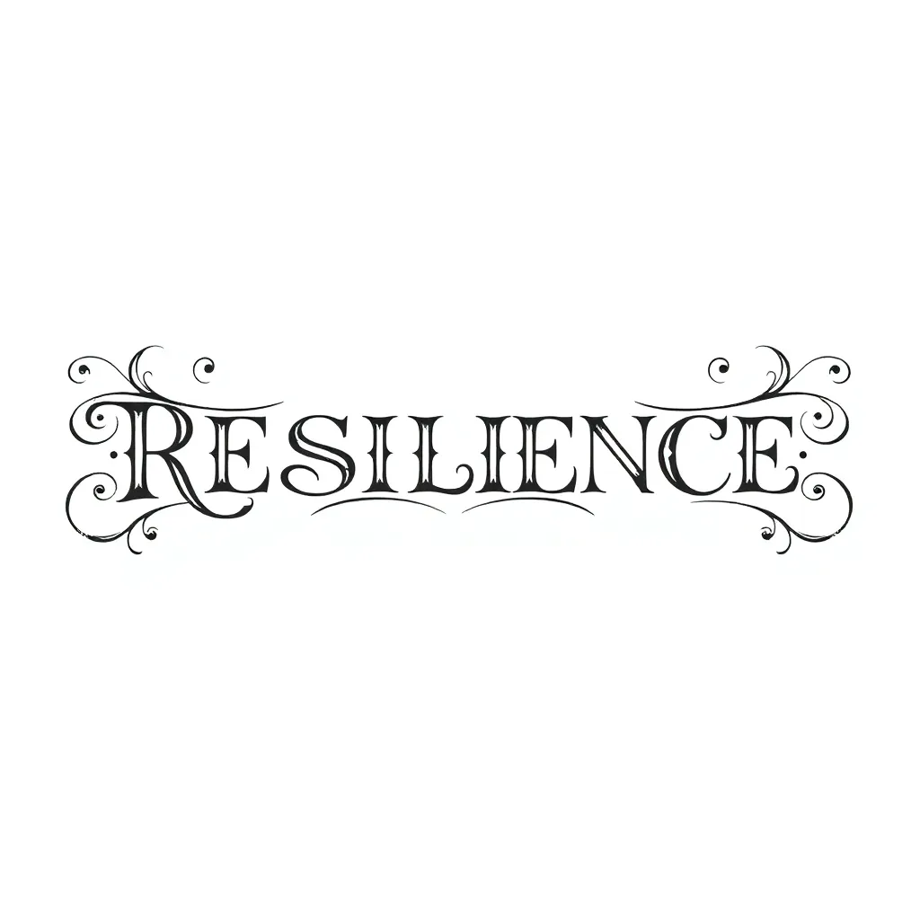
- “The word RESILIENCE in elegant black script with subtle flourishes, clean baseline”
- “A short phrase in bold blackletter across the forearm, strong consistent weight”
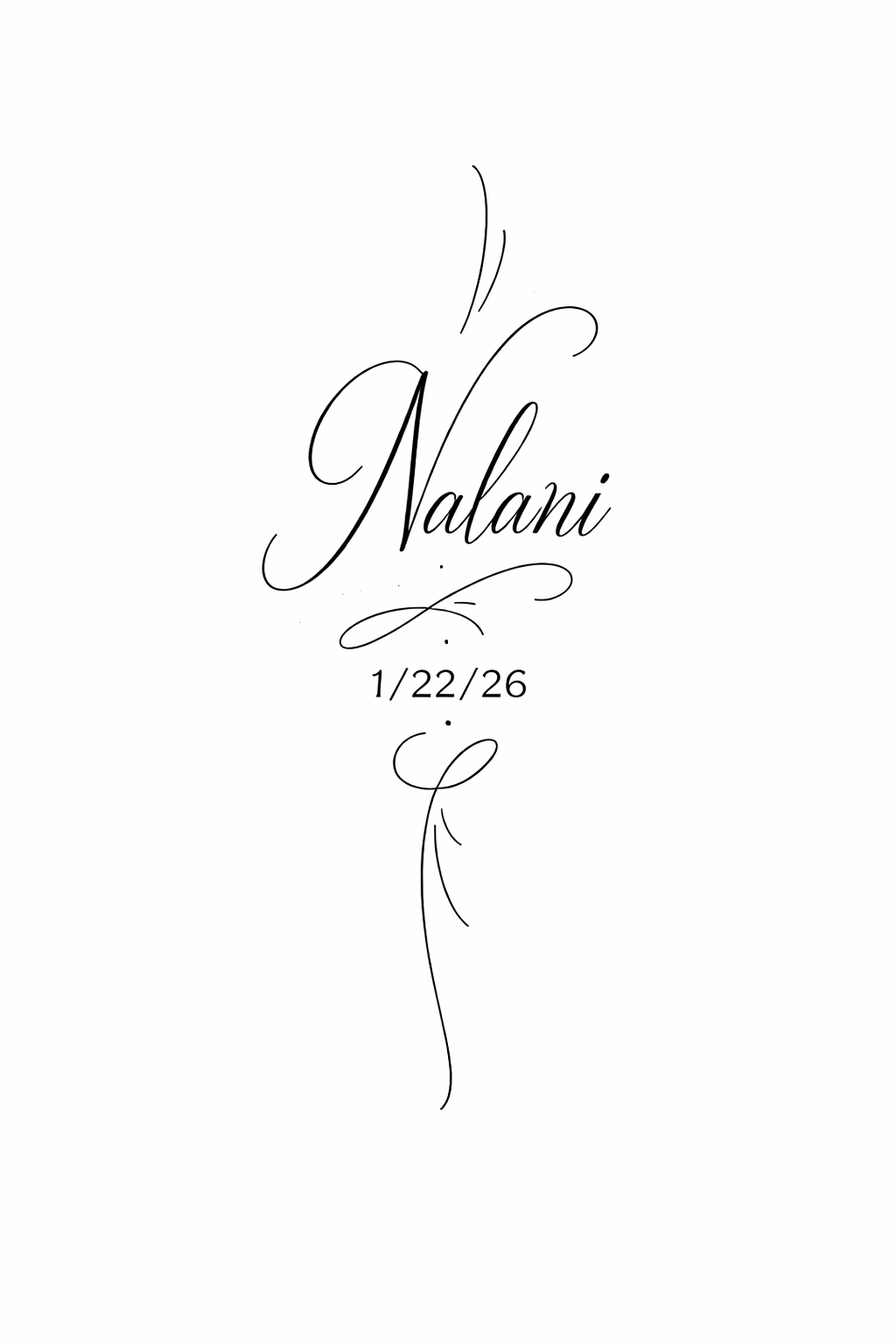
- “A single name in fine cursive lettering with a small underline flourish”
- “A meaningful date in classic serif lettering, balanced spacing, timeless”
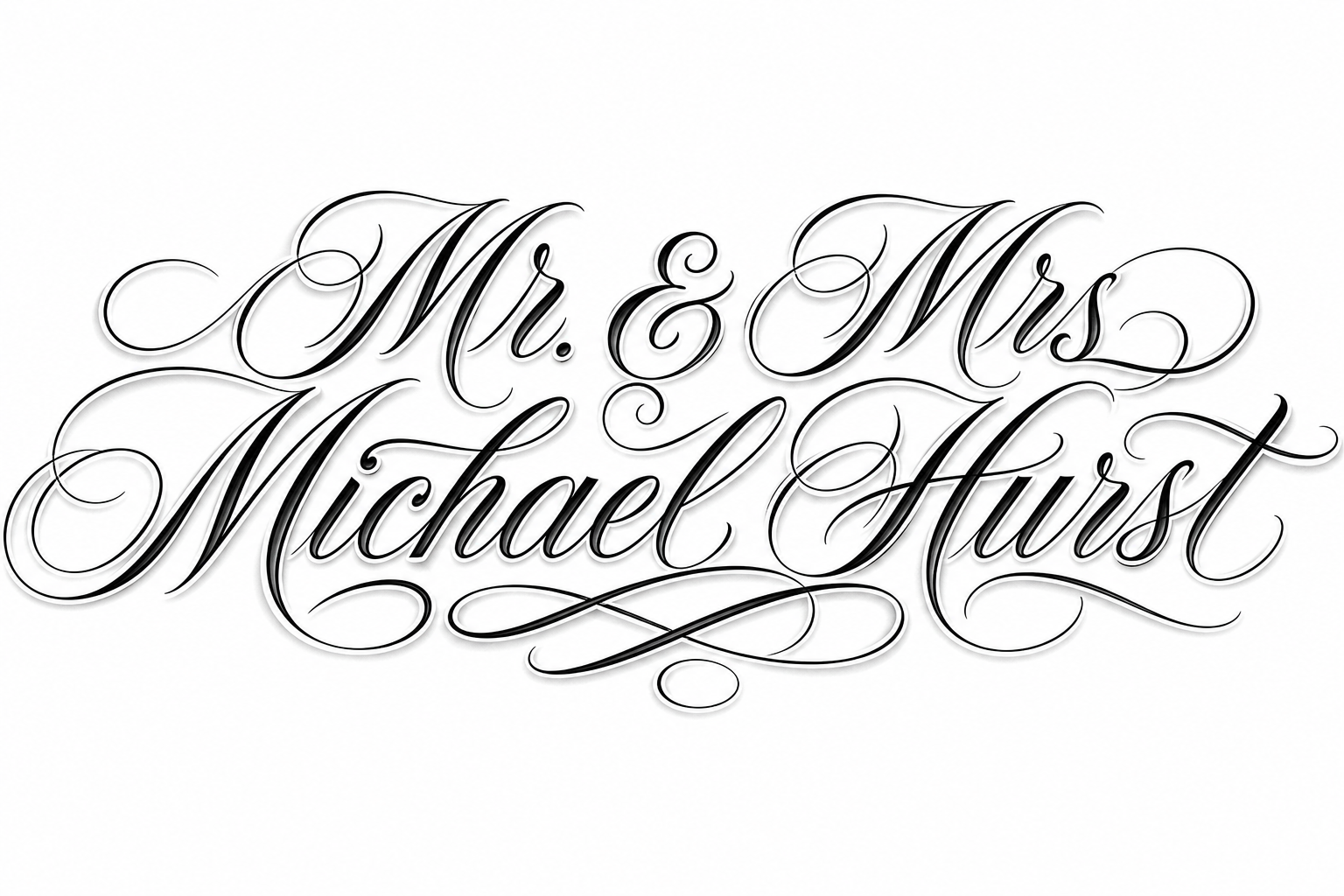
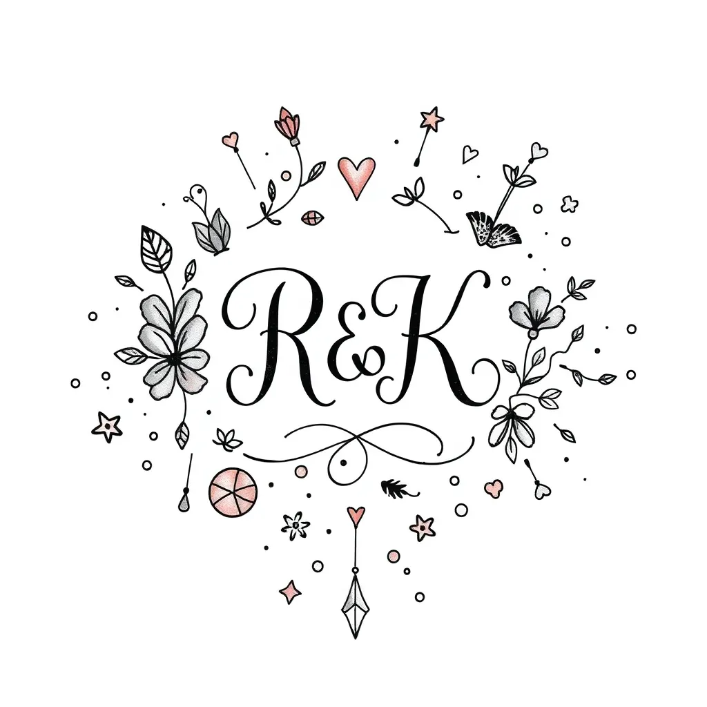
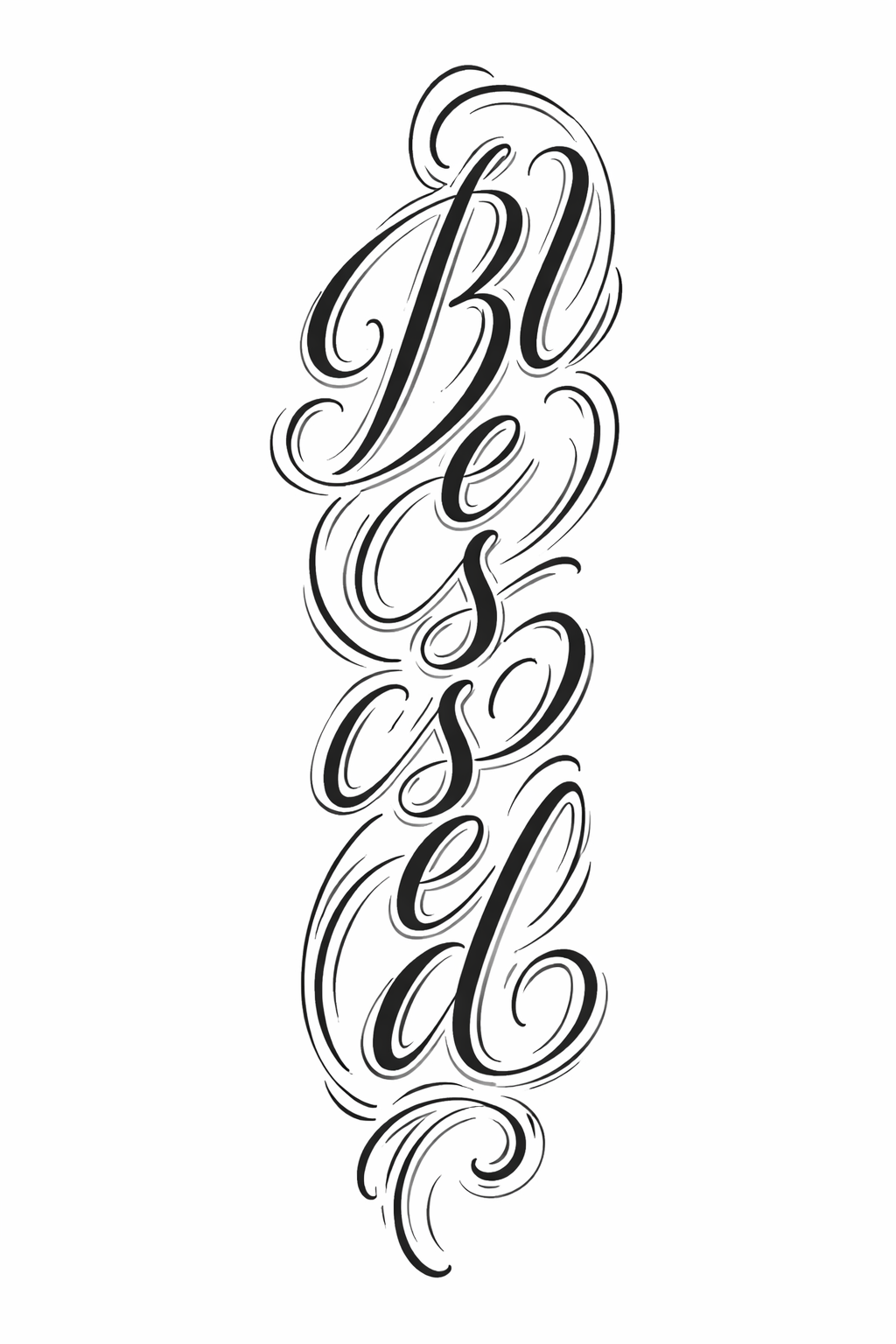
Lettering designs from the community
Related tattoo styles
Lettering tattoo FAQ
- What defines a Lettering tattoo?
- Words as the whole design, treated as typography — script, blackletter or serif where letterform, rhythm and spacing carry the impact.
- How do I keep Lettering readable over time?
- Avoid going too small or too thin, keep consistent letter weight, and choose a clean layout. Letters that are too delicate tend to close up as skin ages.
- Where do Lettering tattoos look best?
- Areas with a natural straight run for a baseline — forearm, collarbone, ribs, upper back — so the line of text stays balanced and easy to read.
- Are Lettering tattoos quick?
- Short pieces are usually fast and gentle; large blackletter or heavily filled words involve more passes and a longer sit.
- Is Lettering good for a first tattoo?
- Yes — a meaningful word or date is a classic first tattoo. Double-check spelling and choose an artist who specialises in lettering layout, not just style.
- How do I prompt the AI for a Lettering design?
- Give the exact text in quotes and specify the lettering style (script, blackletter, serif), plus clean baseline and consistent weight.